Your restaurant’s website is doing one of two things right now: booking tables or losing them. There’s not much middle ground. According to research from multiple hospitality surveys, roughly three out of four diners visit a restaurant’s website before deciding to eat there — and nearly a third say an outdated-looking site is enough to make them choose somewhere else.
I’ve spent years reviewing restaurant technology, and the pattern is clear: the restaurants getting the most out of their websites aren’t necessarily the ones spending the most money. They’re the ones making smart design decisions — putting the right information in the right place and letting the food do the talking.
Below are 10 restaurant website designs that are genuinely worth studying. I chose each one for a specific reason — not just because it looks good, but because it does something you can actually apply to your own site, whether you’re opening your first restaurant or refreshing a website that hasn’t been touched in years.
What Actually Makes a Restaurant Website Work
Before we get into the examples, it helps to know what separates an effective restaurant website from one that just looks pretty. Every strong restaurant site I’ve reviewed nails some combination of these fundamentals:
Contact info and hours visible immediately. This is the number one thing people come to your site for. If a visitor has to click around to find your address, phone number, or hours, you’ve already failed the most basic test. The best sites put this information above the fold or in a persistent header.
The menu is accessible in one click. Not buried three pages deep, not locked inside a PDF that won’t load on a phone. A clean, readable digital menu — or even a simple QR code menu that works on any device — makes it easy for customers to decide what they want before they walk in the door.
Professional food photography. This doesn’t mean you need a $5,000 photo shoot. It means the images on your site should look appetizing and authentic. A few well-lit shots of your actual dishes will outperform dozens of generic stock photos every time.
Mobile-first design. More than half of restaurant website visits happen on phones. If your site doesn’t load fast and look clean on a small screen, you’re invisible to the majority of your potential customers.
A clear path to action. Whether it’s booking a reservation, placing an online order, or just pulling up directions, the most important next step should be obvious. One prominent call-to-action button is worth more than a dozen menu tabs.
With those principles in mind, here are 10 restaurant websites that put them into practice exceptionally well.
1. Canlis — Seattle, WA
Why it’s here: Minimalism that actually works for fine dining.
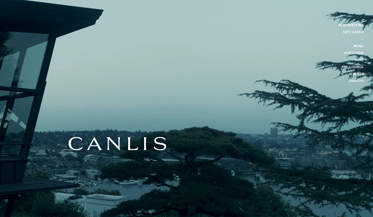
Canlis is a family-owned Seattle landmark that’s been operating since 1950 and was ranked the #2 restaurant in America by Food & Wine in 2025. The website matches that pedigree with stunning restraint. Large, atmospheric photography dominates the homepage — the mid-century modern architecture, the lake and mountain views, the plated courses — with minimal text competing for attention. The navigation is clean and refined, guiding visitors to the menu, reservations, and the restaurant’s story without clutter.
What sets the Canlis site apart is how it weaves the family’s 75-year history into the design without it feeling like a museum. There’s a warmth to the storytelling that balances the exclusivity of a $180-per-person tasting menu. The reservation flow is seamless and prominent without being pushy.
What you can steal: If your restaurant leans upscale, resist the urge to cram everything onto the homepage. Let one beautiful image do the heavy lifting, keep navigation minimal, and weave your story into the design — a note from the chef, a timeline of your history, or a personal touch that humanizes the experience.
2. Loro — Austin, TX
Why it’s here: Illustrated branding that builds instant personality.
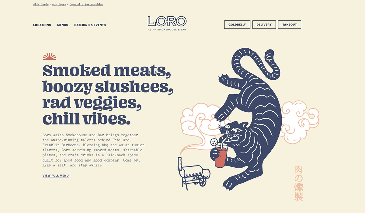
Loro is an Asian smokehouse concept from the teams behind Franklin Barbecue and Uchi, and the website communicates that playful fusion energy perfectly. The hero section blends custom illustrations with food photography, and the tagline — “Smoked meats, boozy slushees, rad veggies, chill vibes” — tells you exactly what to expect in eight words.
What really stands out is how the site handles multiple locations. Each city gets its own section with dedicated menus and hours, but the overall brand identity stays consistent. The warm cream-and-navy palette carries through every page.
What you can steal: Custom illustrations are more affordable than most owners think, and they instantly differentiate your site from the template look. If you’re running multiple locations, Loro’s approach — one brand, location-specific details — is the cleanest model I’ve seen.
3. Girl & the Goat — Chicago, IL
Why it’s here: Bold personality without sacrificing usability.
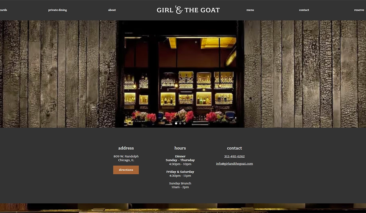
Girl & the Goat, Stephanie Izard’s flagship restaurant, has a website that’s loud, colorful, and unmistakably fun. The design uses quirky fonts, vibrant colors, and energetic photography — but it never sacrifices function for style. The navigation is clear, the menu is easy to find, and each of the restaurant group’s concepts (Girl & the Goat, Duck Duck Goat, Cabra) gets its own clean sub-section.
The site also makes strong use of CTAs and promotional pop-ups for gift cards, merchandise, and events without feeling spammy.
What you can steal: Don’t be afraid to let your restaurant’s personality show on your website. If your brand is fun and irreverent, your site should feel that way too. Just make sure the basics (hours, menu, reservations) are still easy to find. Personality and usability aren’t mutually exclusive.
4. Pizzeria Beddia — Philadelphia, PA
Why it’s here: Proof that simple sites convert when the photography is right.
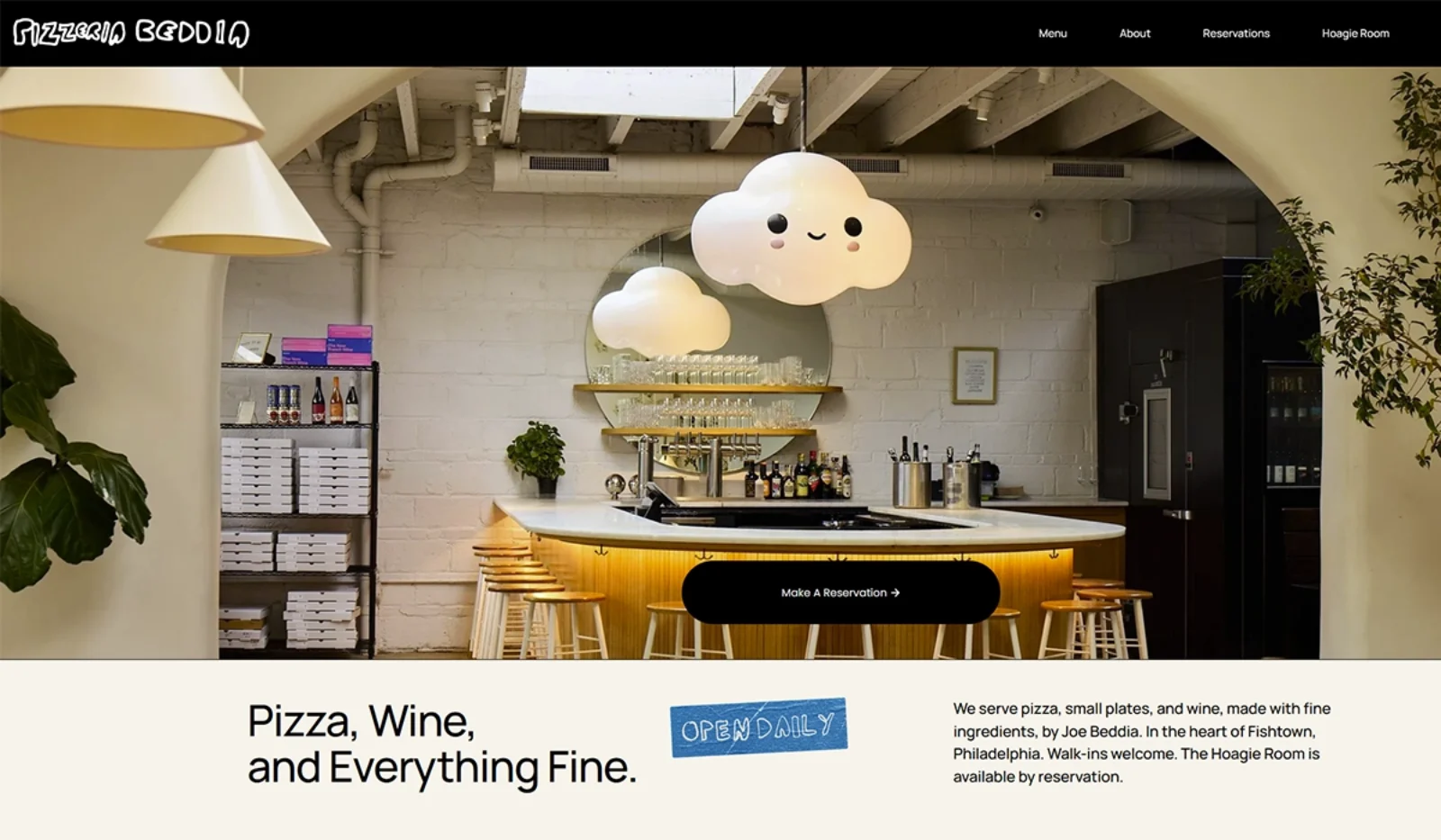
Pizzeria Beddia doesn’t try to reinvent the wheel. The homepage is clean, straightforward, and built around one thing: a hero image of their handmade pizza that makes you want to order immediately. Hours and location are right there. The menu is accessible in one click. That’s basically it — and that’s exactly why it works.
The site also features a banner announcing schedule changes, which is a small detail that makes a big difference for regulars who rely on the website for current information.
What you can steal: You don’t need a complex website to be effective. If you’re a single-location restaurant, one great photo, your hours, your menu, and a way to order or reserve is genuinely all you need. Invest your budget in a photographer, not in flashy web features.
5. Café Du Monde — New Orleans, LA
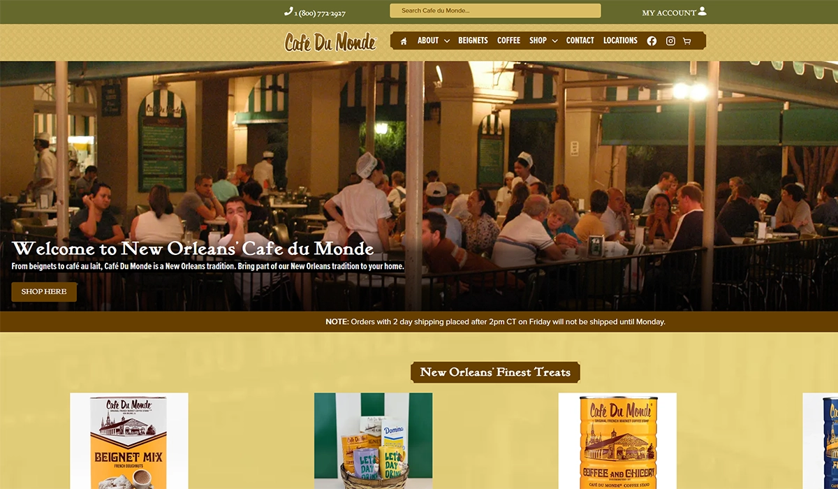
Why it’s here: Heritage brand identity that doubles as a revenue channel.
Café Du Monde has been serving beignets and café au lait since 1862, and the website leans hard into that legacy. The color scheme, typography, and imagery all mirror what you see at the physical French Quarter location. There’s an immediate sense of history and authenticity that you can’t fake with a template.
But the real insight here is the ecommerce integration. Café Du Monde sells its signature coffee and beignet mix online — turning the website into a direct revenue stream beyond the physical restaurant. The online store is seamlessly built into the main navigation, not treated as an afterthought.
What you can steal: If your restaurant has a signature product — a house hot sauce, a spice blend, branded merchandise — your website should make it dead simple to buy. An online store built into your main site will always outperform a separate Etsy page or social media link.
6. Spoon and Stable — Minneapolis, MN
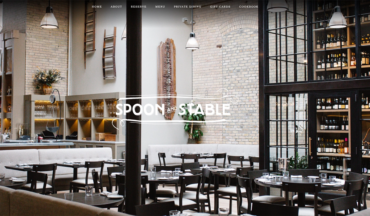
Why it’s here: Smart use of promotional banners and email capture.
Spoon and Stable is one of Minneapolis’ best restaurants, and its website does something subtle that most restaurant sites skip: it uses a drop-down promotional banner that appears when you first visit the site. It’s not a full-page pop-up that blocks your view — it’s a tasteful, easy-to-dismiss bar that promotes events, seasonal menus, or special dinners.
The rest of the design is elegant but unfussy. A slow-rolling slideshow of black-and-white and color photography sets the mood, and the reservation button is always prominent.
What you can steal: A notification-style banner at the top of your site is one of the easiest ways to promote events, holiday hours, or seasonal specials without redesigning anything. Most website builders support this as a built-in feature. It’s also a good spot to capture email addresses for your restaurant marketing list.
7. Nobu Malibu — Malibu, CA
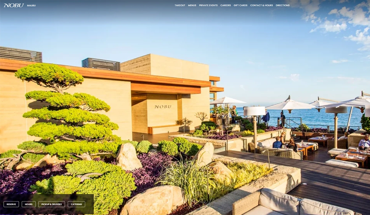
Why it’s here: Leading with venue photography instead of food.
Most restaurant websites put food front and center, and for good reason. But Nobu Malibu makes a deliberate choice to lead with images of the venue — the ocean views, the outdoor seating, the sunset ambiance. For a beachfront restaurant where the setting is a major part of the experience, this is exactly the right call.
The design is minimal and image-heavy, letting the location sell itself. The global Nobu navigation handles multiple properties cleanly, and reservation access is straightforward.
What you can steal: Think about what actually drives people to your restaurant. If you have a rooftop, a patio, a lakeside view, or a beautifully designed interior, your website should showcase that environment as prominently as the food. Not every restaurant’s biggest selling point is what’s on the plate.
8. Carlo’s Bakery — Hoboken, NJ
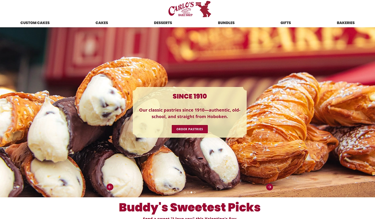
Why it’s here: Turning a website into a full business platform.
Carlo’s Bakery (the “Cake Boss” bakery) has built a website that goes far beyond a simple restaurant page. You can order cakes and cookies for delivery, book baking classes, browse a photo gallery, purchase gift cards, and learn about the bakery’s story — all from one site with clean, intuitive navigation.
The homepage uses large images of their products — cakes, pastries, and specialty items — as the primary visual hook, and scrolling reveals the personal story of founder Buddy Valastro. It’s a masterclass in turning a single-location bakery into a national brand through web design.
What you can steal: If you offer anything beyond dine-in — catering, classes, event space, retail products — your website should make each of those revenue streams easy to access. Carlo’s Bakery proves that a restaurant site can function as a full ecommerce and booking platform when the navigation is done right.
9. Q39 — Kansas City, MO
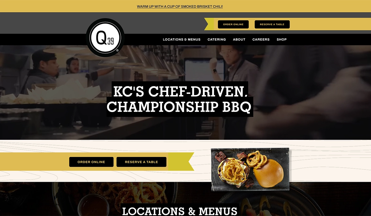
Why it’s here: Video hero that sets the mood instantly.
Q39 is one of Kansas City’s top BBQ restaurants, and the website opens with a quick-cut video loop showing smoked meats, happy customers, and the restaurant’s atmosphere. It’s a format that works perfectly for BBQ — the sizzle, the smoke, the communal energy — and it communicates the experience in a way that static images simply can’t.
Beyond the hero video, the site is practical and well-organized. Catering, locations, menus, and online ordering are all accessible from the top navigation. For a restaurant that serves both dine-in and large-format catering, this clean structure is essential.
What you can steal: A 15-second looping video on your homepage can be more effective than any photo slideshow. You don’t need a production crew — a well-shot smartphone video of your kitchen in action, plates being served, or a busy dining room can work. Just make sure the file is compressed so it doesn’t tank your page load speed.
10. Butcher & Bee — Nashville, TN
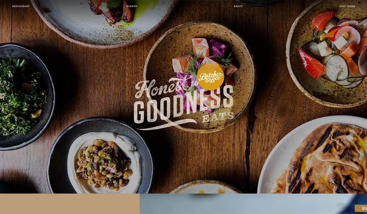
Why it’s here: Editorial-quality layout that feels like a magazine.
Butcher & Bee has one of the most visually striking restaurant websites I’ve come across. The design uses high-impact food photography mixed with texture and thoughtful typography to create something that feels more like a food magazine spread than a typical restaurant site. Each section flows naturally into the next, keeping you scrolling without feeling like you’re being sold to.
The site also handles the dual-location structure (Nashville and Charleston) cleanly, with each market getting its own space while sharing the overall brand identity.
What you can steal: Invest in layout variety. Most restaurant websites use the same structure — hero image, then blocks of text with photos. Butcher & Bee breaks that pattern with asymmetric photo placements, mixed background colors, and editorial pacing. If you’re working with a web designer, show them this site as a reference for what “modern restaurant web design” actually looks like.
How to Build Your Own Restaurant Website
You don’t need a massive budget to build a restaurant website that works. Here’s the realistic breakdown of your options:
POS-integrated websites are the easiest route for most restaurant owners. Many of the top restaurant POS systems now offer built-in website builders that sync directly with your menu, online ordering, and reservation systems. This means one login, one dashboard, and no need to manually update your website every time you change a menu item or adjust your hours. For single-location restaurants, this is often the smartest move.
SkyTab POS, for example, includes a free AI-powered website builder as part of its $29.99/month plan — no extra charge. It generates a custom, mobile-friendly site with your menu, online ordering, reservations, and even gift card sales built in, all synced directly to your POS. You also get a free domain, loyalty and marketing tools, and commission-free online ordering. For restaurants that don’t want to deal with a separate website platform, it’s one of the strongest bundled options available right now.
DIY website builders like Squarespace, Wix, and WordPress are still solid options if you want more design control. Squarespace offers polished, image-forward templates that work well for restaurants. Wix has a drag-and-drop editor with restaurant-specific features like menu builders and reservation widgets. WordPress gives you the most flexibility but requires more hands-on management. Expect to spend $15 to $50 per month depending on the platform and plan.
Restaurant-specific platforms like BentoBox, Popmenu, and Owner.com are designed exclusively for the hospitality industry. They typically include built-in online ordering, SEO tools, and integrations with delivery platforms. These run higher — often $100 to $300+ per month — but the feature set is tailored to what restaurants actually need.
For menus specifically, you can get a digital presence going in minutes. Our free QR code menu builder lets you create a mobile-friendly menu and generate a scannable QR code at no cost. It’s a practical first step if you’re not ready for a full website yet, or a useful add-on to an existing site for dine-in customers who prefer scanning to flipping through a paper menu.
Regardless of which path you choose, keep the fundamentals in mind: mobile-friendly design, fast load times, clear contact information, and an accessible menu. Those four things matter more than any individual design choice.
Frequently Asked Questions
How much does a restaurant website cost?
It depends on the route you take. A DIY builder like Squarespace or Wix runs $15 to $50 per month. Restaurant-specific platforms like BentoBox or Popmenu typically cost $100 to $300+ per month. Hiring a freelance web designer for a custom site usually starts around $2,000 to $5,000 for a basic build. Many POS systems also include a free or low-cost website builder as part of their subscription — SkyTab, for instance, includes one free with its $29.99/month plan.
What pages should a restaurant website have?
At minimum: a homepage with your hours, address, and phone number; a menu page; and a way to make reservations or place an online order. Beyond that, an about page with your story, a contact page, and links to your social media profiles round out the essentials. If you offer catering, private dining, or events, those deserve their own pages as well.
Do I need professional photography for my restaurant website?
It makes a significant difference, but it doesn’t have to be expensive. A single session with a local food photographer — typically $300 to $800 — can produce enough images to build an entire website around. If that’s not in the budget right now, a modern smartphone with good natural lighting can produce usable photos. The key is to shoot your actual food in your actual restaurant. Generic stock photos of food will hurt more than they help.
Should my restaurant menu be a PDF or a web page?
A web page is almost always better. PDFs are hard to read on mobile devices, they can’t be indexed by search engines as effectively, and they require a separate download that many visitors won’t bother with. If you want to offer a downloadable version as a supplement, that’s fine — but your primary menu should be built directly into your website as HTML text that loads instantly and resizes for any screen. A free QR code menu is another solid alternative that works natively on mobile.
How often should I update my restaurant website?
Your hours and menu should be updated in real time whenever they change — nothing frustrates customers more than showing up to find different hours than what’s listed online. Beyond that, refreshing your homepage photos seasonally, updating event listings monthly, and reviewing your overall design once a year is a good cadence. If your website still looks the same as it did three years ago, it’s probably time for a refresh.